

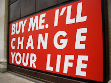
.JPG) Skins (reptiles, wild animals), traditional ethnic clothing, superimposition, mesh/chemicals
Skins (reptiles, wild animals), traditional ethnic clothing, superimposition, mesh/chemicals.JPG) Veil by Laurent Desgrange.
Veil by Laurent Desgrange.Top by Nicone.
.JPG) Hat by Murmur by Spirit.
Hat by Murmur by Spirit.Top by Belle Sauvage.
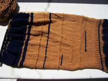
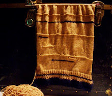
.JPG) Jumper with hoodie by Kid Vanilla.
Jumper with hoodie by Kid Vanilla..JPG) Shoes by Tsure. (was it?)
Shoes by Tsure. (was it?).JPG) Guitar vinyl case by Kipling.
Guitar vinyl case by Kipling.


.png)
.jpg)
.JPG)


4 comments:
love dem colours
:)
nele*
If I was a guitar person, I sure could use one case like that!
BTW, am I the only one here who is strongly reminded of the IKEA logo upon seeing the yellow "EXCESS" sign? Me thinks it's the exact same font.
Is it like an ironic statement?
ha! nice observation!!
as far as the concept is concerned, i sure do think Ikea falls here. about the lettering though, i think this one is thicker and rounder, more pac-man-like.
this is so crazy, i love it!
Post a Comment